Have you ever wondered why some logos stick in your memory? If you knew the secret, would you apply it to your branding? Well, good news! Continue reading to find out what research says about what makes a logo memorable.
The Study Design
The “Branded in Memory” study by Signs.com offers an intriguing exploration into the human ability to recall and recreate brand logos for various well-known brands. The study aimed to measure the accuracy of ten famous logos. The results provide intriguing insights into brand recognition and the impact of logo design on consumer memory, underscoring broader implications for branding and marketing strategies.
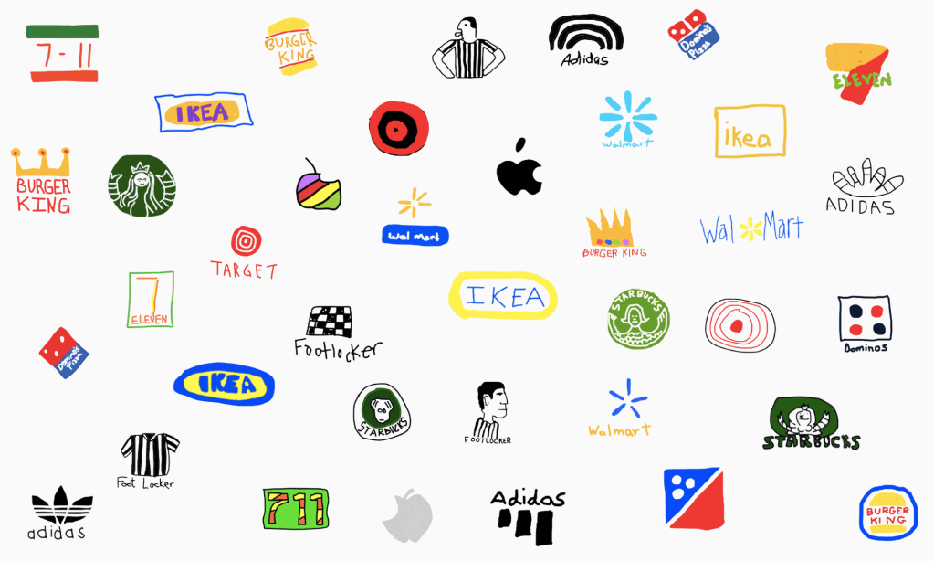
The study involved 156 Americans who were asked to draw 10 iconic logos from memory. The brands included were Apple, Adidas, Starbucks, Domino’s, IKEA, Target, 7-Eleven, Walmart, Burger King, and Foot Locker. These brands were chosen due to their high visibility and frequent consumer interaction. Participants had no visual aids and relied solely on their memory to complete the task. This approach showed which parts of logos are easiest to remember and which parts people tend to forget or change.

Key Findings
Accuracy vs. Recognition: While participants generally could recognize familiar logos like Apple or Starbucks, accurately reproducing them from memory proved more challenging. This distinction highlights the difference between passive recognition and active recall of specific design elements. Despite daily exposure to these logos, many participants struggled with details like exact shapes, proportions, and colors. This phenomenon, termed “inattentional amnesia,” suggests that although logos are seen frequently, they are not always deeply processed or stored in memory with precise detail. This challenges assumptions about how well consumers truly remember the visual identities of widely recognized brands.
Brand Familiarity: Logos with simpler designs and those associated with products or services used more frequently tended to be remembered more accurately. For example, Apple’s clean and minimalist logo and Target’s bold bull’s-eye were reproduced with higher fidelity compared to the more intricate logos of Starbucks or Burger King. The familiarity and simplicity of these logos likely contribute to their easier recall, as they are visually distinct and often encountered in daily life, reinforcing their visual imprint in memory.
Color Importance: The role of color proved crucial in participants’ ability to recall logos accurately. Brands with distinct and consistent color schemes, such as IKEA’s blue and yellow or 7-Eleven’s green, orange, and red, were more easily remembered and reproduced. Color not only enhances brand recognition but also aids in distinguishing logos from competitors and reinforcing brand identity. Participants showed a higher accuracy in recalling logos when distinct colors were involved, highlighting the cognitive impact of color in visual memory and brand association.
Common Errors: Despite overall recognition, participants frequently made errors in replicating specific details of logos. Common mistakes included misjudging element positions, inaccuracies in font styles, and incorrect proportions. For instance, while many could identify Starbucks’ green circle and mermaid, accurately reproducing the mermaid’s intricate details posed a challenge. These errors suggest that while logos are familiar, their finer details may not be well-retained in memory, emphasizing the complexity of visual recall and the influence of simplicity in effective logo design.
Individual Brand Insights
Apple
Apple’s logo was one of the most accurately reproduced. Participants generally remembered the bite taken out of the apple and its simplistic shape. However, the Apple logo, seen by around 600 million people globally, is surprisingly difficult to recall accurately. Only 20 percent of individuals can draw it almost perfectly, omitting common mistakes like adding a stalk (mistakenly included by 1 in 3 people). Designed in 1977 by Rob Janoff of ad agency Regis McKenna, the logo aimed for a businesslike feel after previous iterations featuring Isaac Newton under an apple tree. Steve Jobs insisted on avoiding cuteness and added the iconic bite to scale the apple correctly. Eighty-four percent accurately recalled the Apple logo’s bite, but 22 percent misplaced it on the left side instead of the right. This error rate is lower than the famous misconception about Abraham Lincoln’s direction on the U.S. penny (50 percent). Additionally, some participants (3 percent) depicted the logo in its rainbow-striped form, recalling its appearance from 1977 to 1998.

Adidas
Adidas, the world’s second-largest sportswear company, acquired its iconic three-stripes logo in 1952 from Karhu Sports for two bottles of whiskey and $2,000. Despite its widespread recognition on clothing worn by athletes and consumers worldwide, only 12 percent of participants in the study accurately reproduced the logo. Common errors included depicting four or more stripes and incorrectly using uppercase letters in “adidas.” Additionally, 10 percent drew the Adidas trefoil logo introduced in 1971, symbolizing global diversity. Although the logo is primarily black, 8 percent included blue, reflecting its presence in Adidas’ packaging.

Starbucks
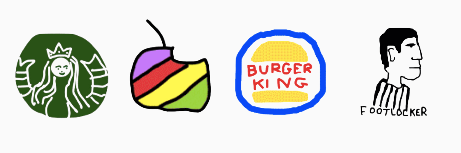
Starbucks’ logo proved to be one of the most challenging. Since its inception in 1971, Starbucks has evolved through three logos, all featuring a twin-tailed mermaid. Originally topless, the logo was simplified in 1987 with hair covering her breasts and a switch to green from brown. The current logo, introduced in 2011, is a green, text-free version. Despite its iconic status, only 6 percent of participants accurately recalled it in the study. Many forgot details like her crown (45 percent) or twin tails (55 percent), making it the least accurately remembered logo among those studied.

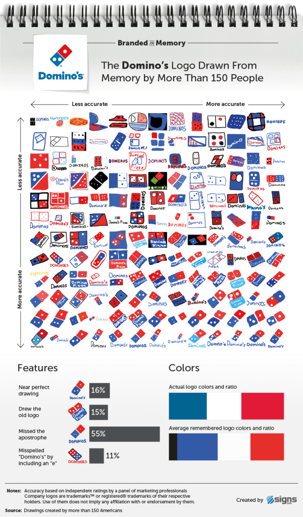
Domino’s
The original Domino’s Pizza logo featured three dots, symbolizing the first three stores owned by founders Tom and James Monaghan. Despite plans to add more dots with new store openings, this idea was abandoned due to rapid growth. In the study, 28 percent of participants accurately recalled and positioned the three dots, while 14 percent drew near-perfect logos. Fifteen percent depicted the older square, tilted logo used from 1996 to 2012, and many incorporated the brand name, often omitting the apostrophe or adding an unnecessary “e”.
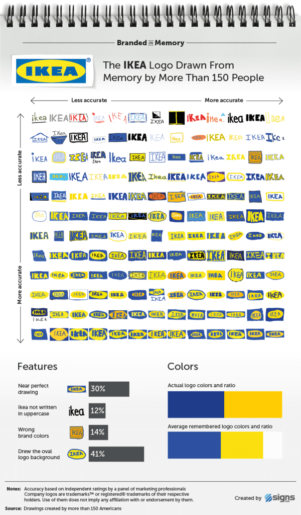
IKEA
Among 156 participants, IKEA’s logo was the most accurately reproduced from memory. Thirty percent successfully recreated its text, shapes, and colors, surpassing Target at 25 percent and Apple at 20 percent accuracy. Notably, 88 percent remembered the all-uppercase format of “IKEA”. The inclusion of the yellow oval behind the blue letters varied: 41 percent included it, reflecting familiarity with both storefront displays and printed materials. The simplicity of IKEA’s logo contributed to its higher recall accuracy compared to other brands in the study.
Target
Target, a major mass-merchandise retailer alongside Walmart, boasts one of the most recognizable logos with its bold red bull’s-eye symbol. In the study, 25 percent accurately recalled the Target logo, with 52 percent drawing it well overall. Notably, 41 percent incorrectly depicted the number of circles in the logo. Despite variations in including the brand name, Target has successfully associated the bull’s-eye alone with its brand in advertising since 2006.
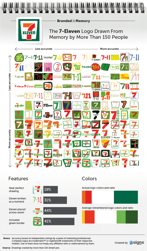
7-Eleven
The 7-Eleven logo, nearly unchanged since 1946, features a numeral seven intersected by “Eleven” inside a white trapezoid against a green background. A significant alteration occurred in 1969 when the top of the “7” turned orange. In the study, 19 percent accurately reproduced the logo, but common errors included writing “Eleven” as a numeral (31 percent) and misplacing it below the “7” (56 percent). Remarkably, only around 1 percent correctly remembered the specific uppercase format of “ELEVEn”. Despite its longevity, the logo’s details remain easily misremembered.
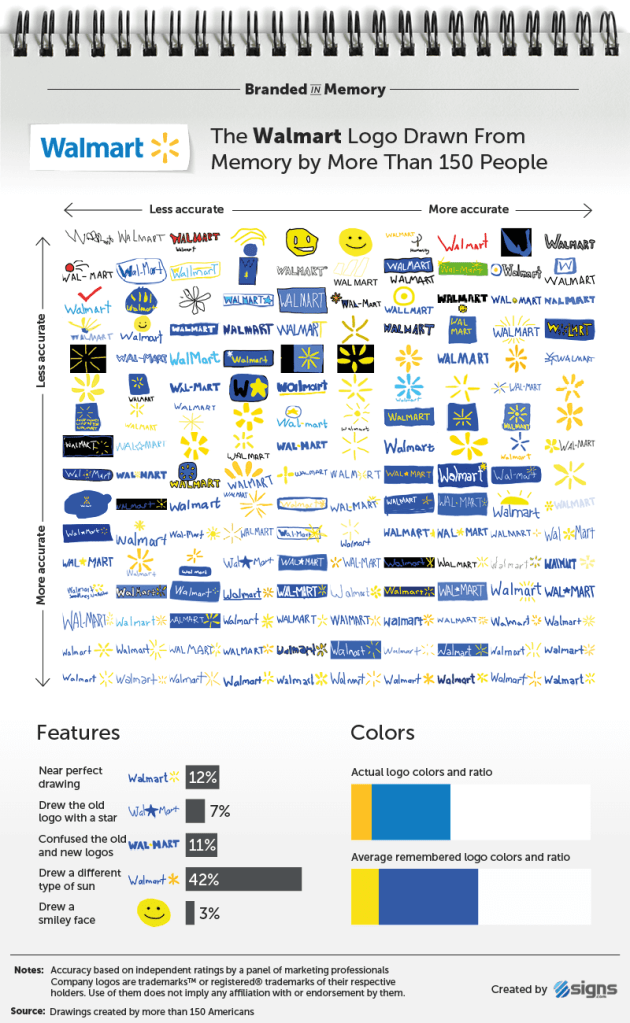
Walmart
Walmart, the world’s largest company by revenue with over 11,500 stores globally, has evolved through several logos since 1962. Initially plain sans-serif text, it adopted the “Frontier Font” briefly before simplifying again in 1981. The logo included a star in 1992, replaced by a sunburst in 2008. Twelve percent accurately recalled the current logo, with many struggling to correctly depict the sunburst’s six points. Confusion between old and new versions also affected accuracy, more so than with other brands studied.
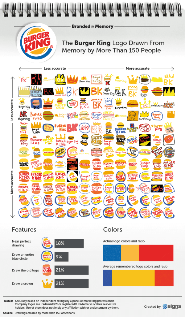
Burger King
Despite Burger King’s slightly more complex logo with three colors and distinct features (text, bun halves, crescent shape), 18 percent of participants accurately recalled it in the study. Interestingly, 21 percent incorrectly included a crown, reminiscent of an earlier logo design discontinued in 1969. Some confusion also arose between the current and previous versions of the logo, suggesting varied recollections among participants aged around 34.
Foot Locker
Foot Locker and Starbucks are unique in the study for featuring figures in their logos, which posed challenges for recall accuracy. Foot Locker’s logo depicts a referee facing right with hands on hips, accompanied by “Foot Locker” in red text. Despite being in use since 1988 and seen globally in over 3,300 stores, only 8 percent accurately reproduced it in the study. Common errors included placing the referee’s hat (18 percent) or drawing unrelated elements like shoes (14 percent), reflecting the difficulty of recalling logos with human figures.

Summary and implications for branding
The experiment aimed to measure how accurately people recall daily seen logos. Most accurately remembered were brand colors (around 80%), while shapes and specific elements posed challenges. Changes in logos over time often led to confusion between old and new versions. Advertisements using symbols not in the logos also caused errors (e.g., Burger King’s crown). Overall, 16% drew near-perfect logos, and 37% were good but not perfect. Younger participants generally recalled logos better than older ones, with minor differences across brands. Gender and brand engagement did not significantly affect accuracy. Judged twice, participants’ self-assessments often differed from professionals’ evaluations, indicating varying degrees of confidence.
Logos from ubiquitous companies like Apple, Starbucks, and Walmart can be challenging to recall due to “inattentional amnesia.” Despite frequent exposure, we often only retain enough information to recognize them superficially. This phenomenon suggests that while we see these logos regularly, we may not truly observe or commit them to memory. Even with increased brand engagement, participants in the study struggled to accurately recall logos. This highlights the surprising fallibility of our memory when it comes to familiar symbols.
Conclusion
Signs.com’s memory test offers profound insights into consumer perceptions and memory of brand logos. The findings underscore that simplicity, distinct colors, and regular exposure are pivotal elements in crafting memorable logos. Logos like those of Apple, Starbucks, and Walmart, despite their ubiquity, often elude accurate recall due to what has been termed “inattentional amnesia.” This phenomenon suggests that while individuals see these logos frequently, they may not actively observe or commit detailed features to memory.
For businesses, these insights are invaluable. They highlight the importance of designing logos that are both visually simple yet distinct enough to stand out amidst a cluttered visual landscape. A well-crafted logo can enhance brand recognition and recall, fostering stronger connections with consumers. By leveraging these principles, businesses can optimize their branding strategies to ensure their logos are not only noticed but also remembered and associated with positive brand attributes.
Furthermore, the study’s findings challenge assumptions about consumer engagement with brands. Even those who engage more frequently with a brand may struggle to accurately recall its logo details. This underscores the need for brands to continuously reinforce their visual identity through consistent exposure and strategic design choices that resonate with their target audience’s visual memory capabilities.
In conclusion, Signs.com’s memory test provides actionable insights for businesses aiming to enhance their brand presence and effectiveness through thoughtful logo design and strategic branding initiatives.
Source: https://www.signs.com/branded-in-memory/
Whether you’re building a brand from scratch or seeking a refresh, we’re here to assist you! Our services encompass branding, web development, social media management, content creation, consulting, and educational packages. Explore our services page and reach out today to start the conversation about how we can support your growth.

Author:
Barbara Buljat Raymond, Ph.D.
Digital marketing specialist